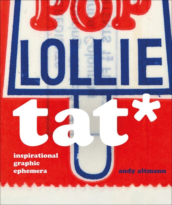
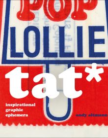
TAT*
Inspirational Graphic Ephemera
- An unrivalled source book of inspirational graphic ephemera, the result of 30 years of collecting and sorting
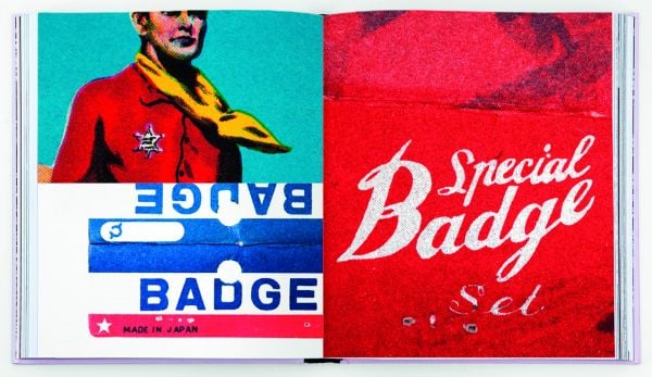
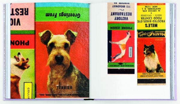
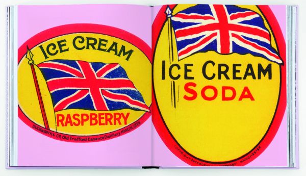
- A visual treasure trove, completely eclectic and full of surprises
Tat* is a bit of a graphic designer’s curse. Walk into any design studio and you will see tat pinned to the walls or placed with loving care on top of a computer screen. Even the purist will have a secret cache hidden away somewhere.
Andy Altmann began collecting tat while he was on his Foundation course, getting ready for an interview at St Martins School of Art. He’d been asked to present a sketchbook, but worried that he couldn’t draw very well, he decided to start a scrapbook: “I rummaged through the drawers at home and found some football cards from the late 1960s and early ’70s (plenty of Georgie Best), an instruction leaflet from an old Hoover, Christmas cracker jokes, and so on. Then I started on the magazines, cutting out images of anything that interested me. And finally I took myself off to the college library, where I photocopied things from books before reaching for the scissors and glue.” It was the beginning of a significant collecting habit.
So what it is that makes a piece of graphic tat interesting? Is it the ‘retro’ thing – a fascination with a bygone age, the primitive printing techniques, the naivety of the design, or the use of color? All of the above, of course, but it’s not quite that simple. “Occasionally people offer me something they’ve found that they think I might like”, says Andy. “But usually they’re wrong – it doesn’t excite me at all. The magic is missing.”
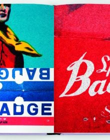
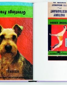
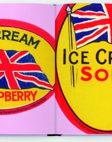
To a graphic designer, most the content of this book can safely be regarded as ‘bad’ design. But there is some magic in each and every piece that has made Andy either pick it up off the street, trail through online links, or enter some dodgy looking shop on the other side of the world just to snap it up. Here you’ll find everything from sweet wrappers to flash cards, from soap powder boxes to speedway flyers, from wrestling programmes to bus tickets. More tat than you can shake a stick at. Taken together, it represents a lifetime of gleeful hunting and gathering.
* tat (noun) – anything that looks cheap, is of low quality, or in bad condition; junk, rubbish, debris, detritus, crap, shite
- Publisher
- Circa Press
- ISBN
- 9781911422273
- Published
- 5th Apr 2021
- Binding
- Hardback
- Territory
- USA & Canada
- Size
- 8.27 in x 9.84 in
- Pages
- 400 Pages
- Illustrations
- 400 color
- Name of series
- Andy Altmann
Our Catalogs
Browse Our Books
Please log-in or create an account to see your recent items.
